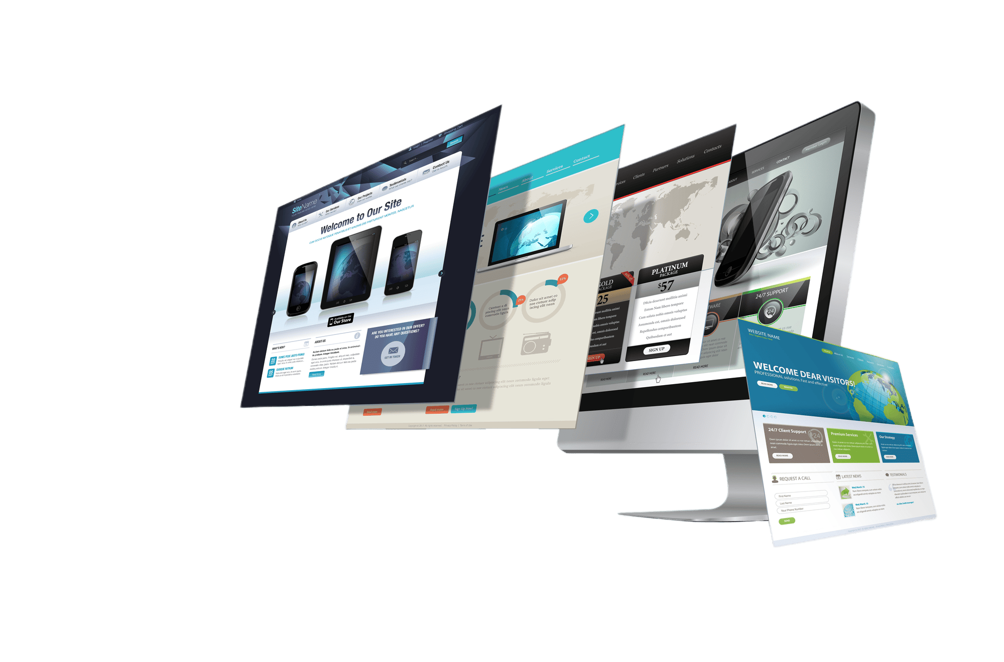
When you first click on your website you have 5 seconds to catch a visitor’s attention. You can quickly lose a potential customer if your website is too messy, too confusing, too formal. This article will provide you with 4 Key features of an engaging website to allow you to grow your clients. You want the first impression for your visitor to be positive. Here are examples of homepages that have made their first impressions acceptable.
4 Key features of an engaging website
- Navigation –The rule of 3 clicks, the customer should get to your product or service in 3 clicks or less. The objective of a UX designer is to simplify users’ tasks. In certain places, the fewer clicks a client has, the less likely they will leave the website. This also helps keep your clients focused on their goal of purchasing your product or service.
- CTA – A Call To Action (CTA) is an invitation on a website that allows the user to perform specific actions. For example, a command or a phrase, ‘Sign Up’ or ‘Buy Now,’ is usually a call to action and usually comes in the form of a button or hyperlink. In the marketing industry, the text can take the form of a button (a CTA button) or a web link. When sending email campaigns, CTAs can also connect to a web page to take additional actions. The call to action is a vital part of a web site that acts as a symbol for the user. Without a clear CTA, the user may not be aware of the next steps to take to purchase a product or sign up for a newsletter and is likely to leave the site without carrying out their tasks. Opoptimizely provides a great article that thoroughly explains the CTA and its importance.
- Design- Website design is an essential part of how your clients will view your business. The below elements should be placed into consideration when designing your website.
- White space- It is loved by designers. The owners of the website want to fill it. What is this? White space! Whitespace is one of the most neglected and unused components in a great web design project. Too often, the area is viewed as empty space and, as a result, as a waste of screen space. However, whitespace is one of the most valuable components of your design. For good reasons, white space is an essential design feature. If used properly, the design will alter and provide the website with several advantages. Web designers must create and produce eye-friendly layouts that make people want to continue reading. If you would like to read more about white space, seguetech has a detailed article on the subject.
- Layout- Layout design is a crucial web design area that deals with text and visual arrangement. Great layouts look attractive, but an efficient layout lets the audience understand the message conveyed by the design. In other words, the understanding of the structure of web design is essential in the development of user-friendly and engaging designs. What is the style of the layout? Let’s make sure that we are aware of what the layout is. Briefly, the layout design refers to designing visual elements in a grid to deliver a specific message. The strategy is ineffective, no matter how stylish it looks, if a design does not read well to the audience.
- Responsive design- Responsive Web design is the technique that implies that design and development should respond based on screen size, platform, and orientation to the user’s actions and environment. Many web designers have implemented responsive design into their projects. Your website must look impressive both on big screens and mobile devices. For an example of responsive design, visit Faith Web Designers and look around to notice the responsiveness of the website. We have also published an in-depth article on a mobile-first design that shows the importance of responsive design.
- Content – Well written content on your website will keep your users engaged and staying longer. The opposite can be said for poorly written content. Written content can also affect SEO. Website content is a simple way to maximize the usability of your website. A user-friendly website can allow prospecting clients to stay longer on your website. They won’t go back as quickly to the search results. Google will report your action with a higher rating and award you.
- Loading Speed – When creating websites, many designers use the 5-second attention span rule for website loading. You have five tiny seconds to make an immense impact and have your prospective clients take action on your website; otherwise, they will bounce somewhere else. You must explain your value, your organization, and what you do for your clients during these five seconds. Suppose your website has a slower loading time. In that case, if the client’s attention span is necessary, your clients will look elsewhere to find the information they need. Please take a look at the loading time for this website we have built to compare to others. The approximate load time for this site is 1.1 seconds, which fits well below the five-second rule.
In conclusion, at Faith Web Designers, we provide our clients with quality websites and focus on concepts that will allow them to grow. Our website’s performance is far beyond what you would expect. We pride ourselves on providing value and respect to our clients. If you would like to schedule a free consultation or request additional information, please contact us today!


